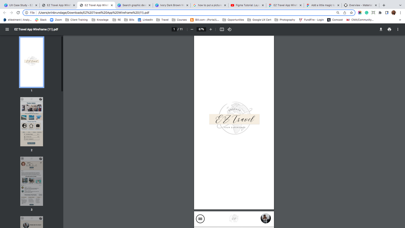
product: EZ travel mobile app
Erin
Brundage
portfolio
role: UX Research & visuals
resume


duration: May 2022 ( 6 months)
reallygreatsite

hello, I'm
User Experience Designer
Erin Brundage
Erin
Brundage
UX Designer
I am a User Experience Designer based in Atlanta, Ga. My specializations include design custom design experiences for target audiences and implementation.
Current Location
Atlanta, Ga
User Experience Designer, 2021-2022
Client Content Analyst
2018-2022
Queens University of Charlotte,
2012-2016
Resume
Project Vision
Background
EZ Travel App is an international customer service app for travel agents. For this project, I used a user research design that was focused on personas and research insights.
The purpose of this product was to develop a mobile application to help new and frequent travelers book destination trips and custom itineraries by using their own personal advisor.
challenges
1) Access to trusted travel information
2) Consolidating the travel booking experience on one platform
3) Design a creative interface for new and current travelers
4) Provide a seamless & easy travel booking experience
methodology
- 5 participants
- 3 females, 2 males, and 1 non-traveler individual between ages 25-62
- 20 minutes per participant
- United States, remote
- Moderated Usability Study
- Users were asked to look to perform tasks while looking at a low-fidelity prototype
User Research
kickoff
In this project, we took the goal-research approach gained from test early concepts to help support the design efforts. We gathered qualitative research to be the most useful that consisted of interviews, usability test, competitive analysis, personas and insights . We started out with research questions:
- How often will the users be traveling or need an advisor?
- Which type of travel will most users need assistance on?
- why travelers should use a travel agent?
- Does using a travel advisor reduce time and money?
- what is the product for and target audience?
Research
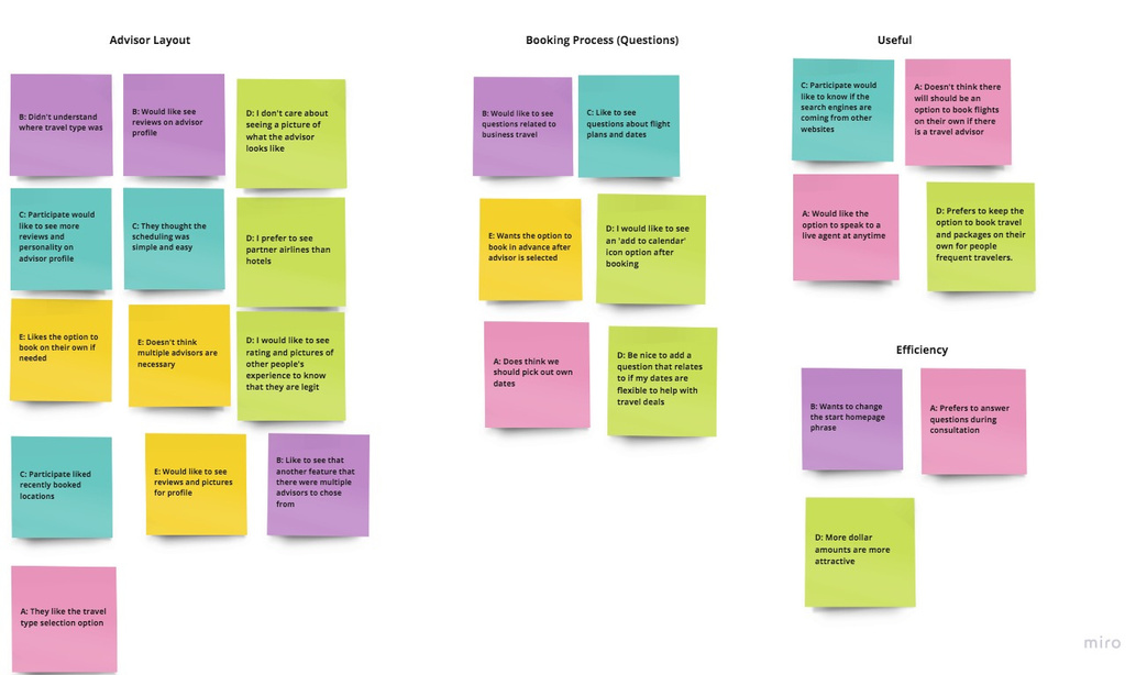
I found data from the usability testings to be the most useful and understanding for iterations and research goals. I then used an affinity chart to separate the data into groups which were further categorized to help improve. These categories included Scheduling Layout, Process, Usefuleness, and Efficiency.
Meet the Participants
participant
Name: Destinee
Age: 31
Occupation: analyst
Destinee is a young professional in the city of Atlanta who likes to travel on the regular and get away from the hustle and bustle of the Financial Tech Industry. Even though Angela might have the flexibility to work remotely most days, she still would like an easy way and quick way to plan her travel as a one-stop shop like the EZ Travel app.
participant
Name: alexis
Age: 27
Occupation: photographer
Alexis is a tenured entrepreneur in Atlanta who has built his own business and operating for the past 5 years. He is very successful and manages most of his work and a small team. He enjoys luxury travel to new destinations but prefers someone to plan for himself and a small group that includes prices and preferred partners.
participant
Name: david
Age: 62
Occupation: project manager
David is a Project Manager for over 20 years that works on a remote island and getting close to his retirement. He enjoys traveling internationally but prefers to explore destinations where most crowds do not tend to flock to. However, finds researching this is very hard these days.
Meet the Participants
participant
Name: erynn
Age: 45
Occupation:
nurse
Erynn is a traveling nurse based in Chicago that likes to enjoy a girl's trip every other quarter. She prefers trips more domestic trips and easy access to information or people who will help her compare flights, accommodations, and affordable deals.
participant
Name: geo
Age: 37
Occupation: accountant
Geo is an accountant who has not taken the time to travel throughout his career or lifetime but would like the opportunity to. He is not familiar with the process but prefers to have a thorough itinerary and recommendations to get the most out of his first-time traveling experience to domestic and international destinations.
Competitive Analysis
I looked at several companies that compete directly or share similar concepts with EZ Travel App. EZ Travel App has the opportunity to let users book their travel plans on one platform making it an easy one-stop-shop for personal travel customization.
The majority of features between competitors were similar to booking a trip, however the main difference that we noticed:
- Personal Advisor with travel experience in Business, Domestic, and International travel vs Individual Booking
- Structured user flow on one platform vs Outsourced API results
- One product offering vs multiple product offerings for a target audience
- Specialization in custom bookings


Journey Map
User Flow
I constructed a user flow of what a basic start-to-finish journey looks like when scheduling a consultation with an advisor for a trip. The user flow helps understand how the user can interact with the application, as well as use navigation to plan their travel goals.
Consultation Confirm
Homepage
Open App
Fill
Questionnaire
Homepage
Questionnaire
Select
Travel
Type
Book
Agent
Advisor Page
Browse
Advisors
decision
page
action
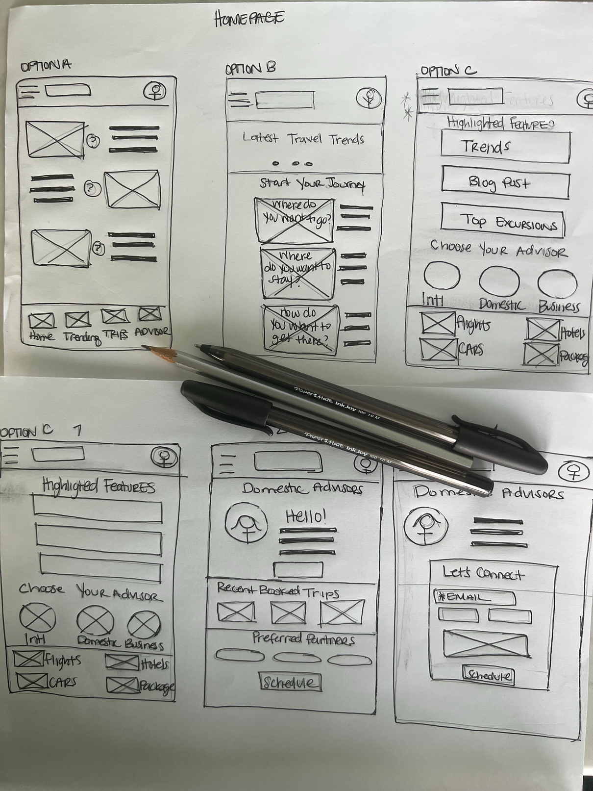
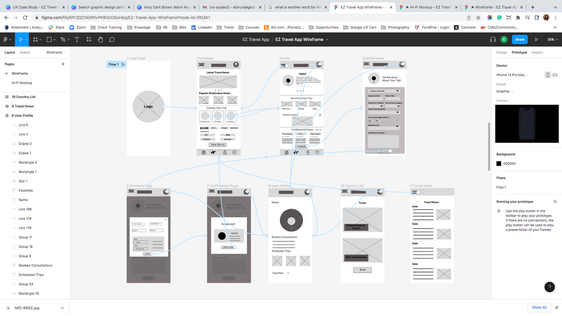
Wireflow
After outlining some wireframe options of the initial user flow, I reviewed what made sense to the user goals with a lo-fidelity wireframe based on interviews and what areas for navigation needed improvement, along with relevant pages that match the primary user flow. This was a key step in the design process before placing visuals.
Iteration
After creating the initial prototype derived from the wireframes, I prepared a usability testing spreadsheet that consisted of 8 prompt questions for participants to follow while navigating the lo-fidelity prototype. I asked 5 different participants to walk through the prompts based on the prototype to gather feedback to use for the next design iterations.
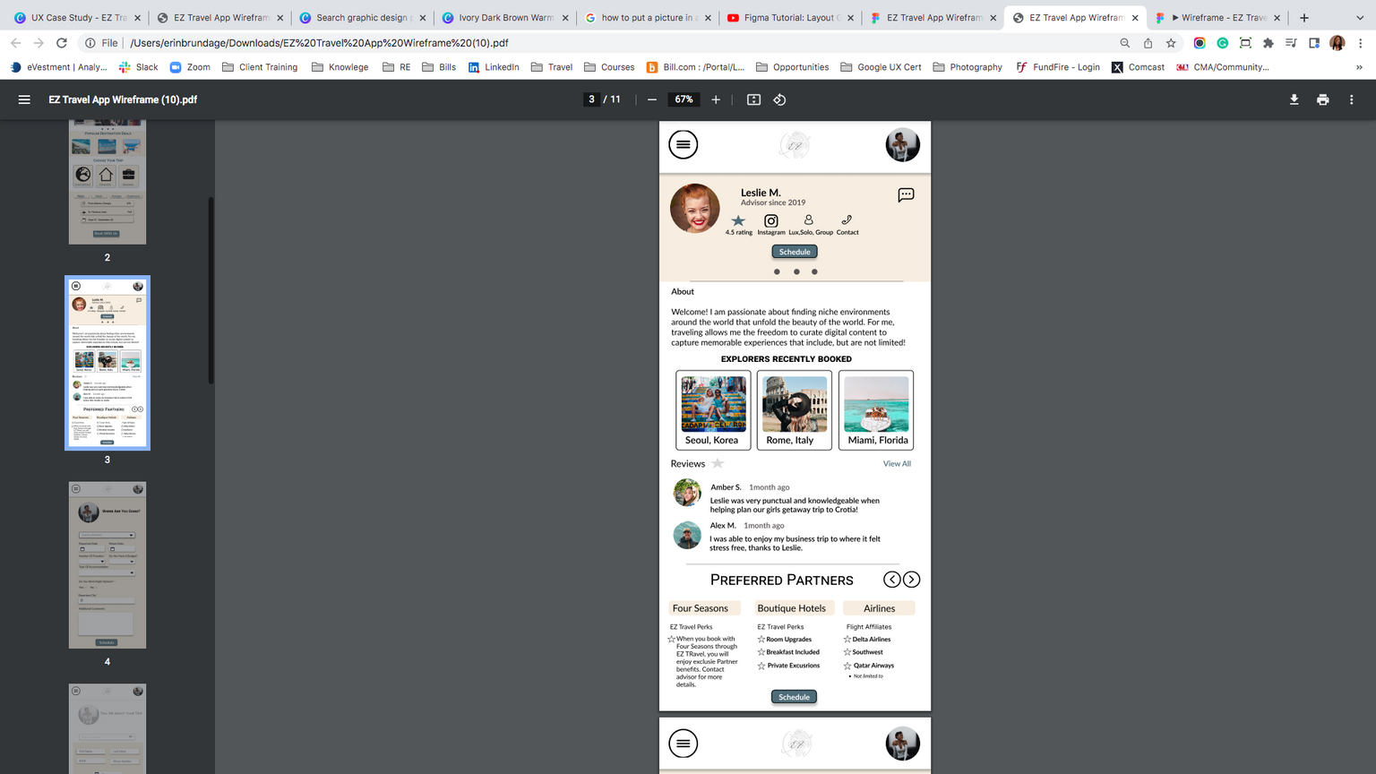
Need Reviews
I found that most users who traveled often and planned trips on their own preferred to see reviews and/or pictures along with call to action features to depict experience on an Advisor's profile.
trending?
Having a intital trending news hero that leads to relevant articles on the home page gave users security on trusted sourced information.
No Incentive
After testing, all users wanted an incentive to use the application or reason to use an advisor for planning travel due to search engines providing the autonomy to do it on their own
Questions
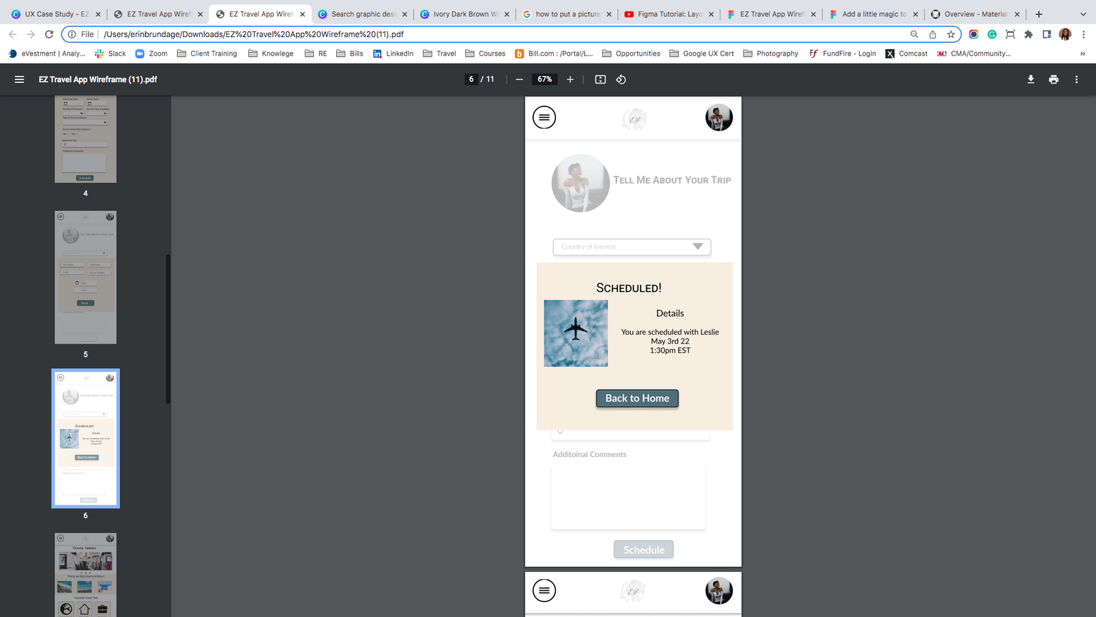
Seprating the questions for the consultation with dropdowns and various answer styles kept the user engaged. However, most users were not oppose to adding more questions and having the country of interest the main point of the page.

Challenges
Access to Information
While EZ Travel is targeted at users to connect with a live travel advisor, I found it was also important for the user base to be able to trust the source of information outside of scheduling a consultation. EZ Travel showcases the relevant information with layouts, titled shadow effects, and automatic gestures.
Consolidation
The goal for the UI to book flights, packages, and an advisor goal was to still give the user familiarity with what they are used to on other platforms when planning their trip. The main landing page has a mixture of iconography, and color to break out sections you want the user to focus on to help organize how they want to start their travel and be enagaged.
Simple Process & Design
I decided to link the travel-type icons directly to an advisor profile and kept the consistency of keeping the reviews, pictures, and perks on one page. This allows the app to be more seamless for new users who do not want to be overwhelmed with too mangy options or avenues to book a trip or plan an itinerary.
STYLE GUIDE
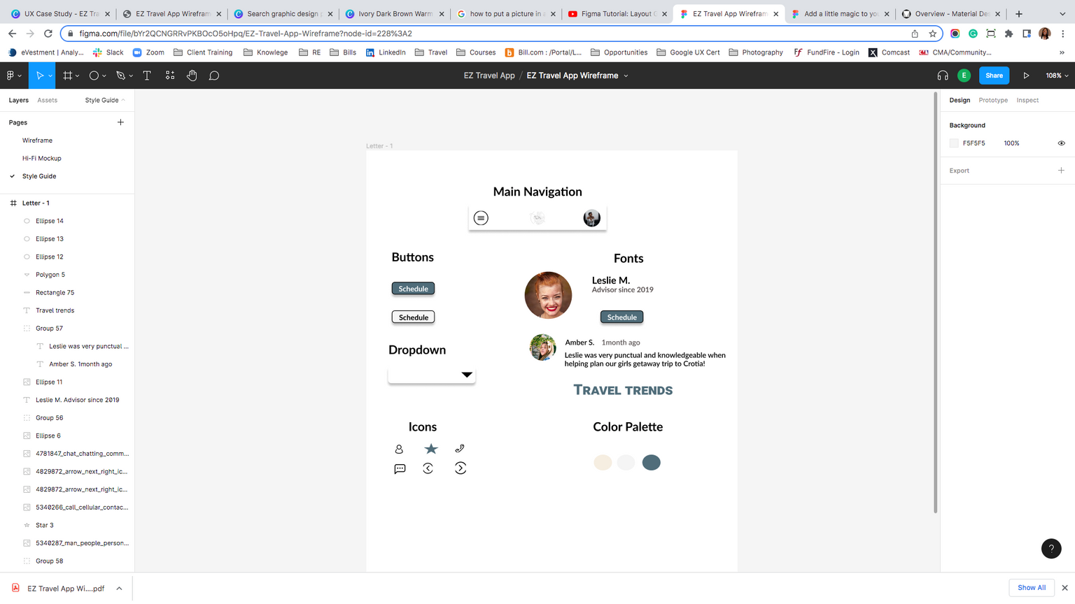
Designing a color palette that has natural, warm colors to create the EZ Travel App layout grid helped focus on different sections of the user's journey. Though the process is simple to schedule a consultation to travel, using color, familiar iconography got for calls to action, and typography hierarchy guided a particular engagement and kept consistency.

Mockup
Body
Web Design
The Product
Digital nomad is a website that presents resources for remote travelrs to be comfortable to work anywhere in the world.
Project Duration
September 2022- November 2022
Add a Call-to-Ation
Project Overview
The Problem
Available online resources for travelers who want to work anywhere in a fast-growing remote world can make the process inefficient or cause confusion when maintaining a work-life balance because of the lack of resources.
The Goal
Digital Nomad website is a platform for digital nomads to get quarterly and yearly suggestions to travel to places that will make their remote experience seamless .
My Role
UX designer leading the Digital Nomad responsive website design
Responsibilities
Conducting Interviews, research competitor audits, paper and digital prototyping, usability studies, iterating on designs and responsive design.
Website
User Research
Research Statement
I conducted user interviews, which then led to engagement maps to better understand the target user and their needs. During there process, I discovered that many target users treat their traveling experience as their own but want a sense of community and a resource center to help curae their own ideas. However, many traveling websites neglect the needs of digital nomads and only tailor to traditional tourism
Pain Points
1. Navigation
Traveling websites are often busy, which leaves users overwhelmed or left out based on their trip type.
2. Interaction
Too many elements on travel websites can make the user not know where to start or be over saturated,
3. Experience
Travel websites are leaning towards collecting monetization in order to provide resources that can be researched crossed multiple platforms.
profile
Gender
Age
Education
Occupation
Address
:
:
:
:
:
Female
28
Bachelor's degree
Marketing
123 Anywhere St., Any City


I want to be able to have a work-life balance while traveling and exploring other countries.
Biography
Olivia is a 28-year-old analyst who also has a couple of sides- gigs that keeps her busy. Though she keeps herself busy, she likes to travel or bring her work with her in her free time.
Goals
"Like to see options only pertaining to digital nomad travel "
"I would still like to see travel suggestions on what to do when at the destination to help with the work-lief balance "
Frustrations
"I struggle with finding new places to visit "
"Not all international countries can a
accommodate a co working environment "
"It is frustrating trying to find people who work while traveling in interesting places"
personality
Introvert
Extrovert
Thinking
Feeling
Judging
Perceiving
Sensing
Intuition
Olivia Wilson
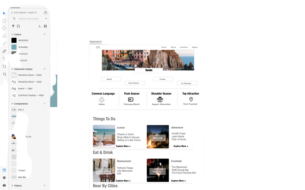
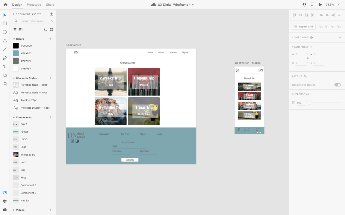
Sitemap
home
About
Mission Statement
Reviews
Partnered Affiliates
Why
Trip types
2 Weeks
1 Month
6 Months
1 Year
recs
Guides
Airport Transfer
Accomodations
Community
contact
Join Notification
Link to an Advisor
Partnered Affiliates
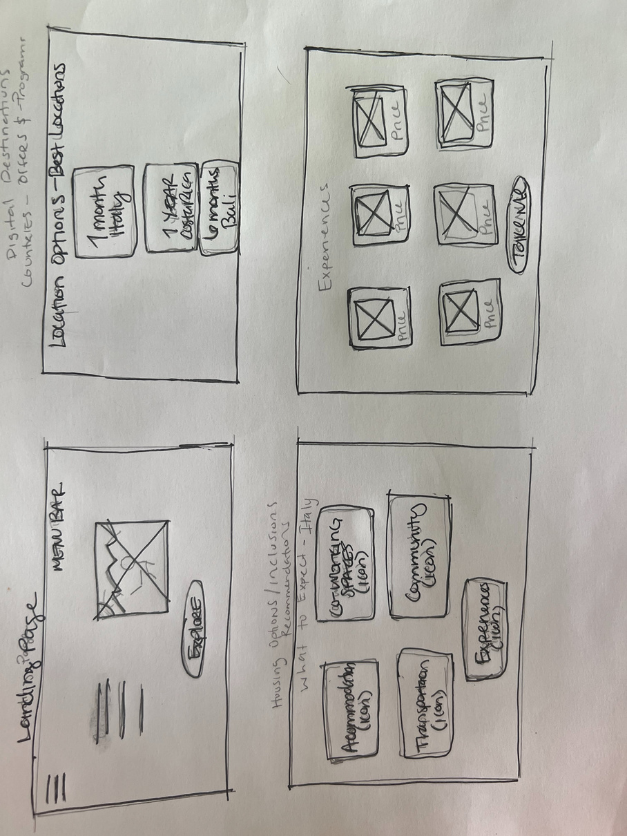
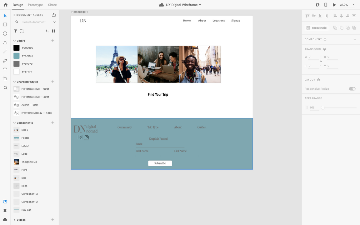
digital wireframe

Easy Access to suggested
digital nomad locations
The location page is optimized
for easy navigation and visibility
Simplicity and using pictures as the focal point helped make it easier for the target audience of young digital nomads eager and comfortable to travel to new places while still working.
Social Good
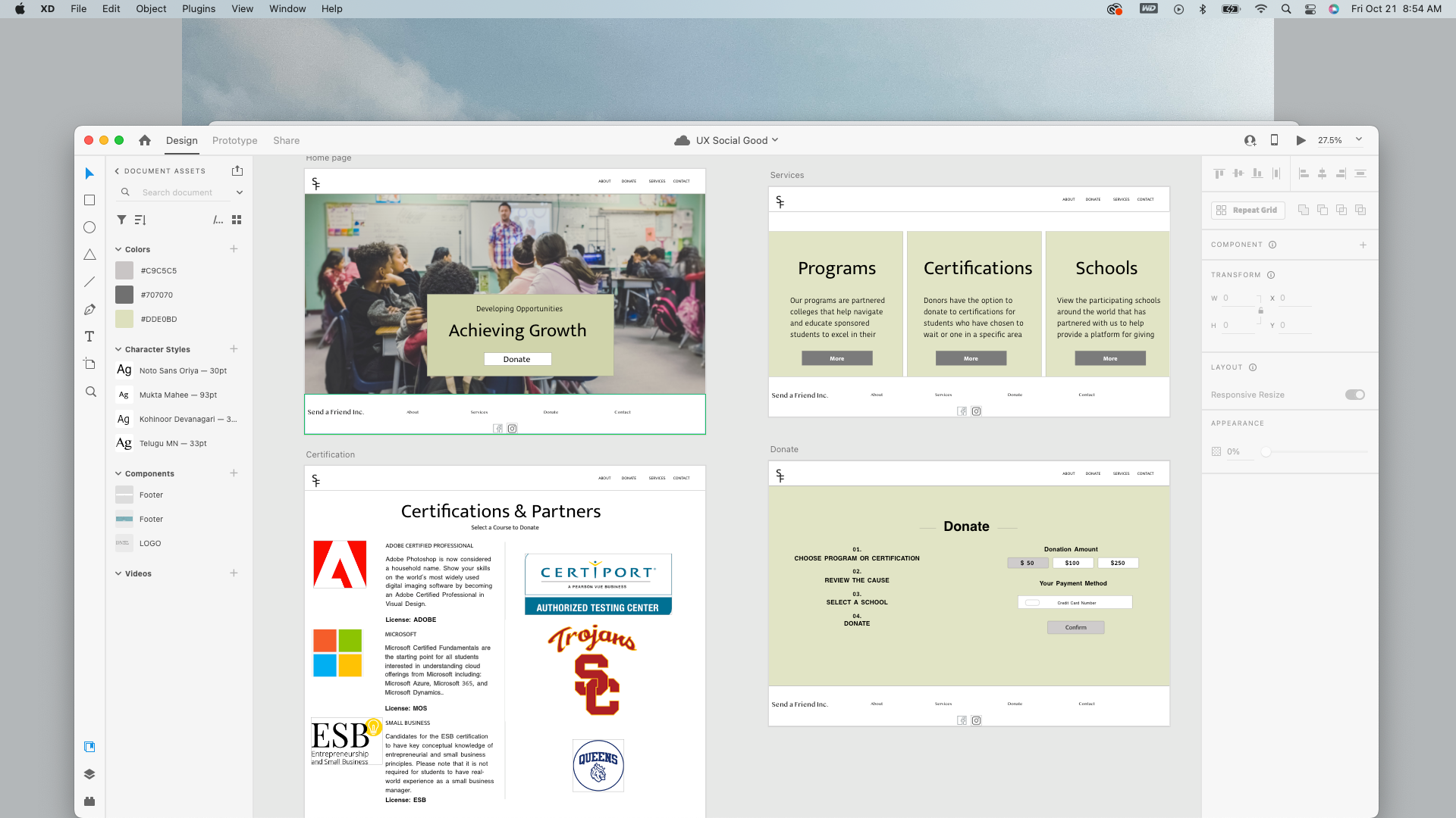
The Product
Send a friend website is a platform that provides a source for people to donate and send high schoolers overseas for higher education or invest in a certification
Project Duration
November 2022- December 2022
Add a Call-to-Ation
Project Overview
The Problem
There are a limited amount of funds allocated for international students in high school to have the means to get education or certification from their own interest
The Goal
Send a friend website provides a space for people to donate a giving amount that caters to a particular college program or certification.
My Role
UX designer leading the Send a Friend responsive website design
Responsibilities
Conducting Interviews, research competitor audits, paper and digital prototyping, usability studies, iterating on designs and responsive design.
Website
User Research
Research Statement
Many international students do not have equal access to higher education or resources or tools that allow them to excel in different avenues once they find their niche in their education. Send a friend will give international students a chance to seek better education or hone in on specific area of interest.
1. Navigation
To many links or no instruction of who and what they are giving to
Pain Points
2. Interaction
Donaters sometimes don't have insight into where their money is going or how an individual is doing after they have donated
3. Experience
Social Good sites sometimes can be overwhelming or redundant when provided an outlet for the same cause.
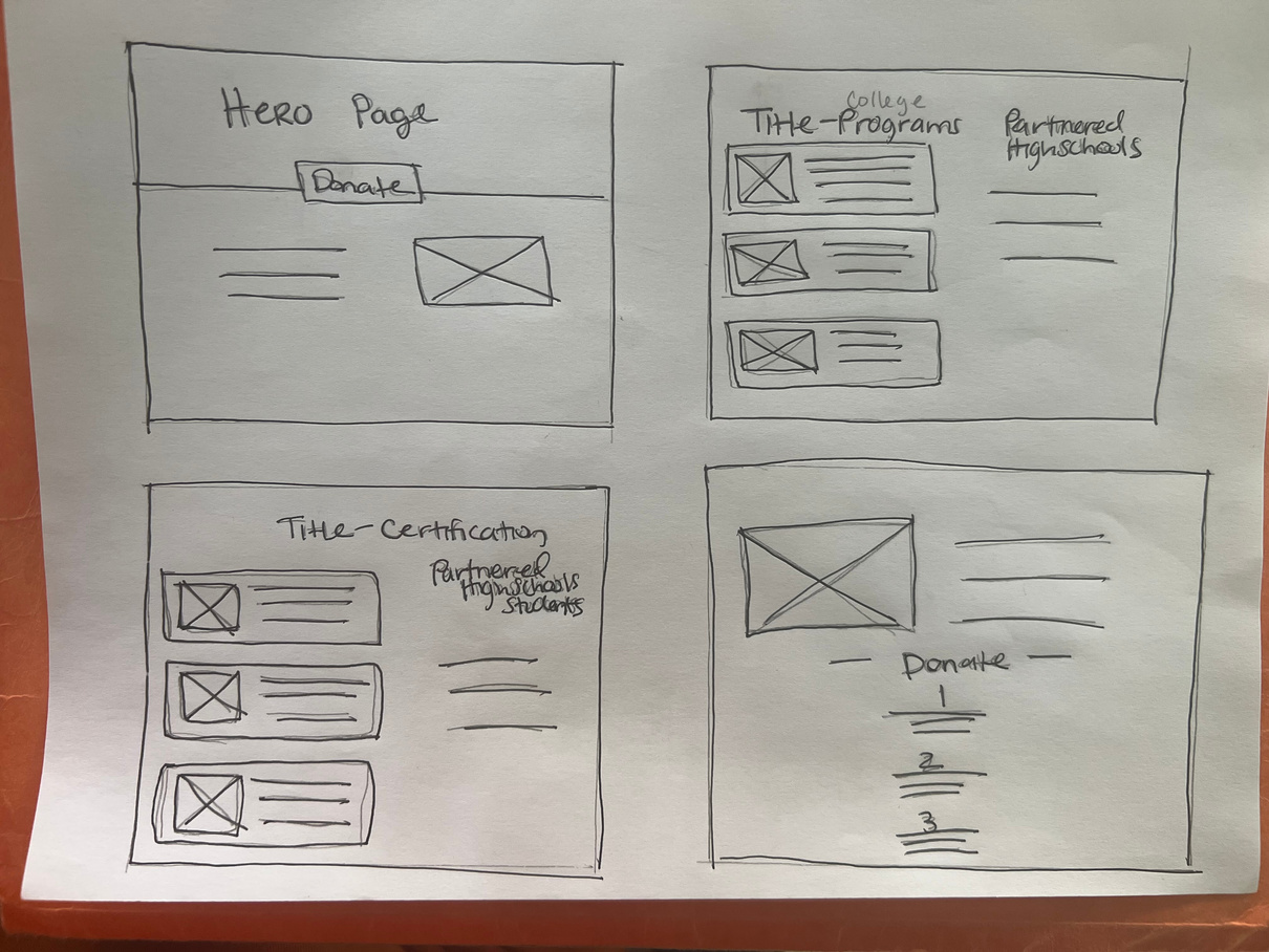
Iteration
After creating the initial prototype derived from the wireframes, I prepared a usability testing spreadsheet that consisted of 4 prompt questions for participants to follow while navigating the lo-fidelity prototype. I asked 5 different participants to walk through the prompts based on the prototype to gather feedback to use for the next design iterations.
Descriptive
locations
follow the student
step on donating
Wireflow
Work with me

ADDRESS
123 Anywhere St., Any City, State, Country 12345
Phone
(123) 456 7890
hello@reallygreatsite.com